Latitudes 20° is a premium bean-to-bar chocolate brand built around a single idea: that great chocolate begins long before the bar. It begins with the land, the latitude, the origin.
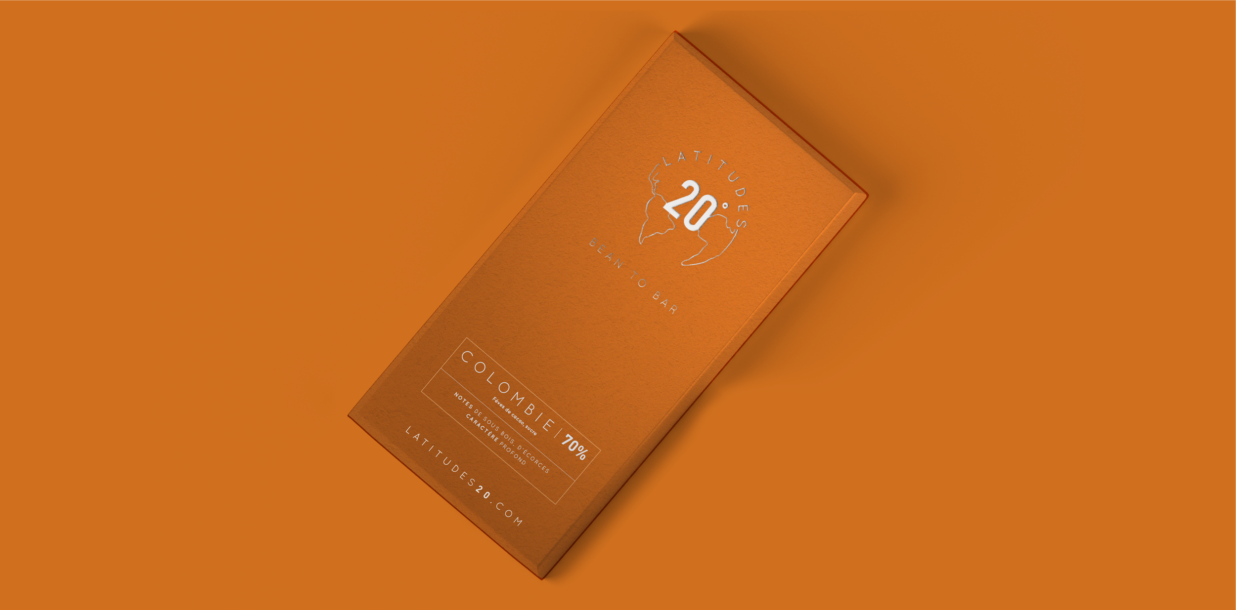
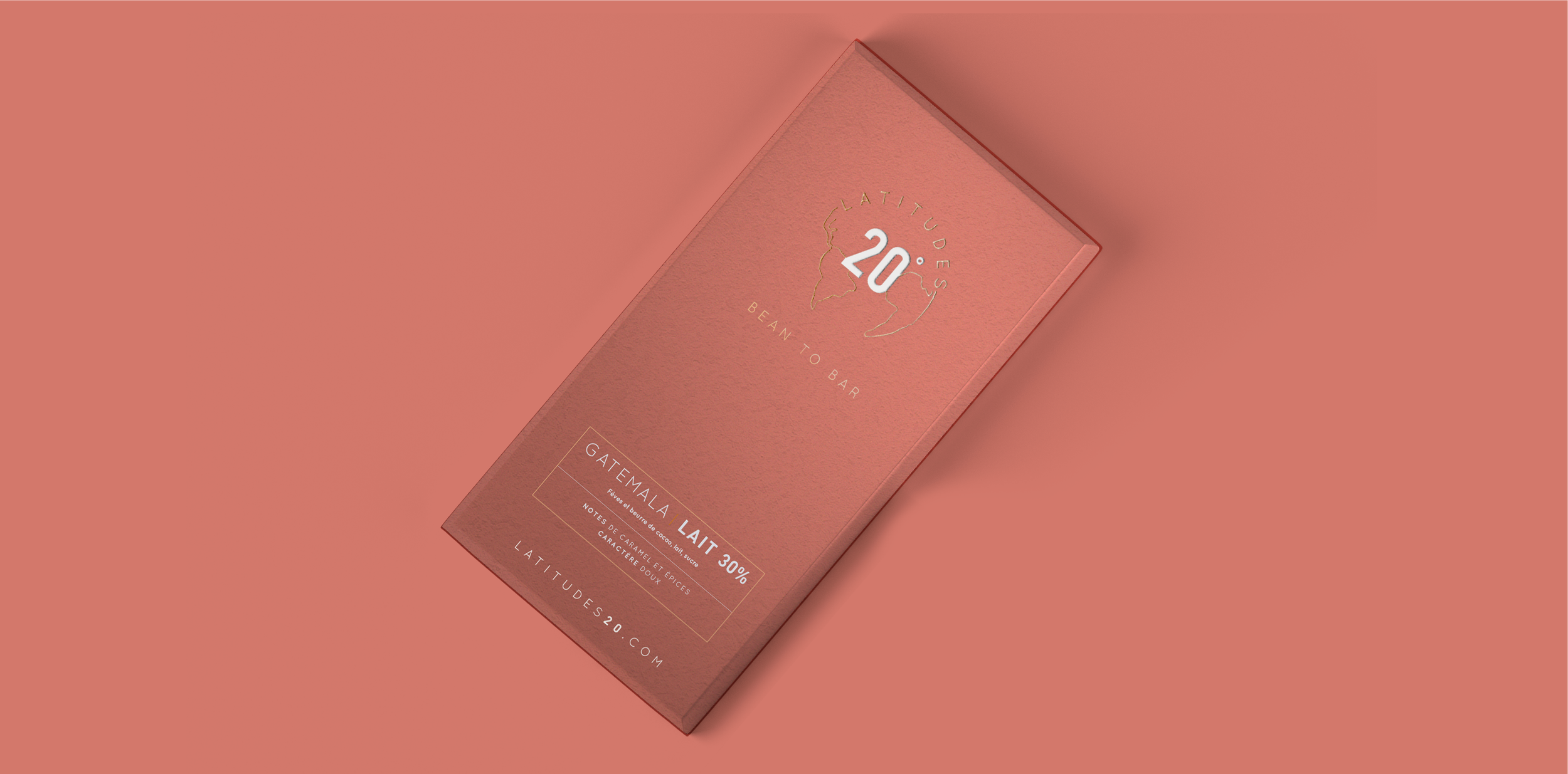
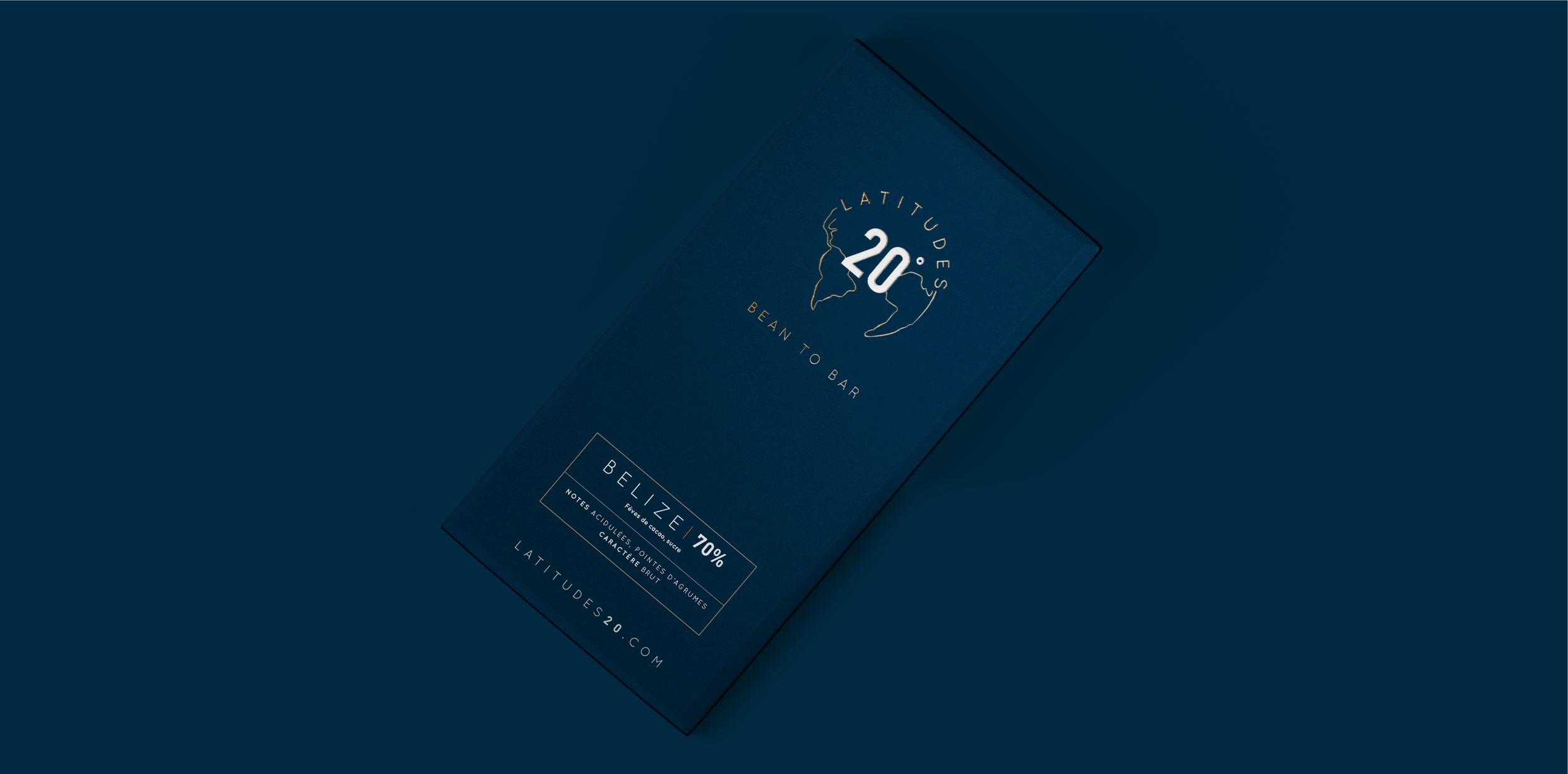
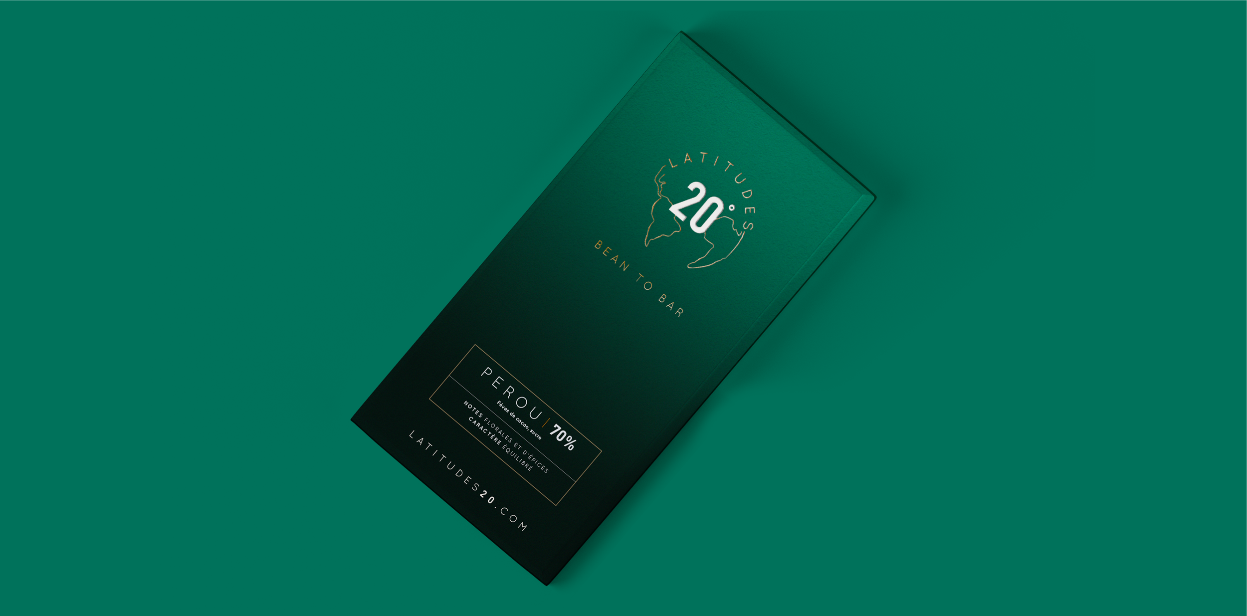
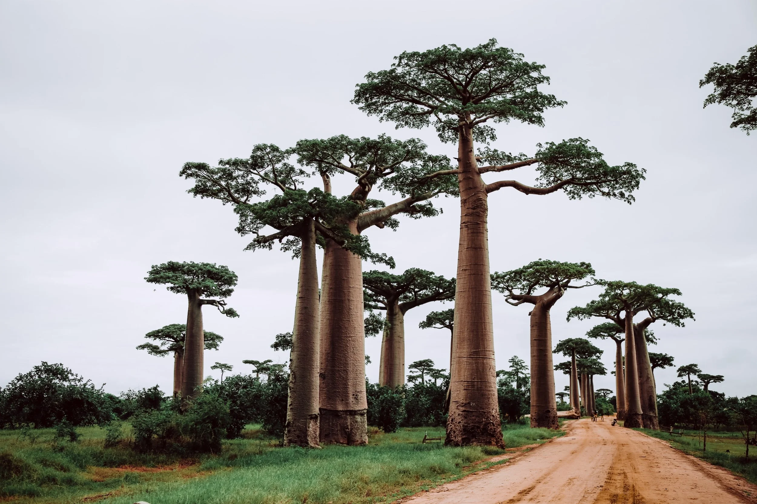
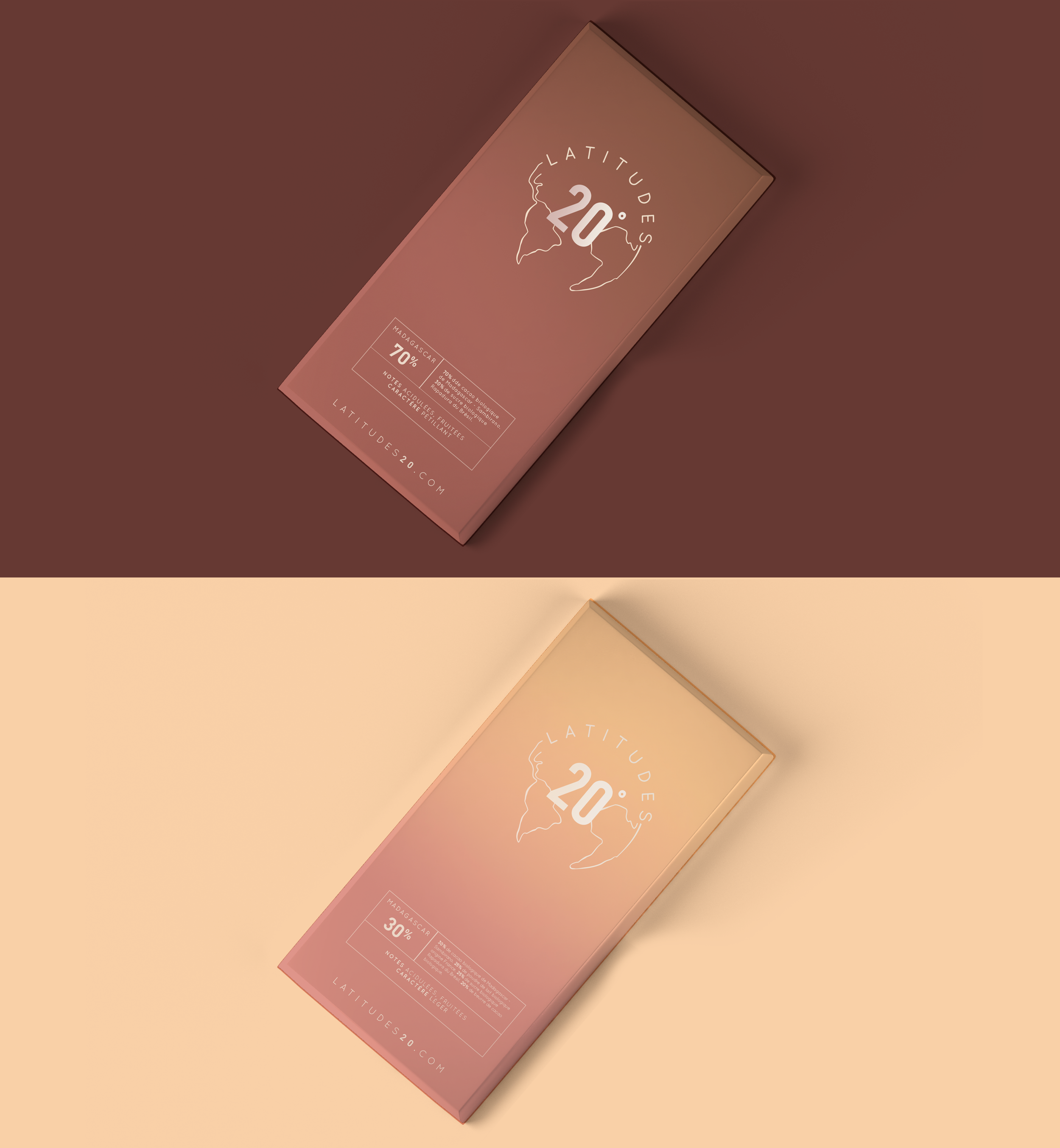
For this project, I developed the full brand identity — from naming logic to visual system — with a creative direction rooted in geography and craft. The color palette is not an aesthetic choice; it's a cartographic one. Each recipe draws its hues from the warm, layered tones of the environment where its cacao is grown — the ochres of Colombia, the deep reds of Peru, the earthy terracottas of Madagascar.
Latitudes 20°, not just a chocolate brand.


The logo captures the same spirit: a gradient that shifts and breathes, forming what the brand defines as a living, organic whole.

the packaging
〰️
the packaging 〰️
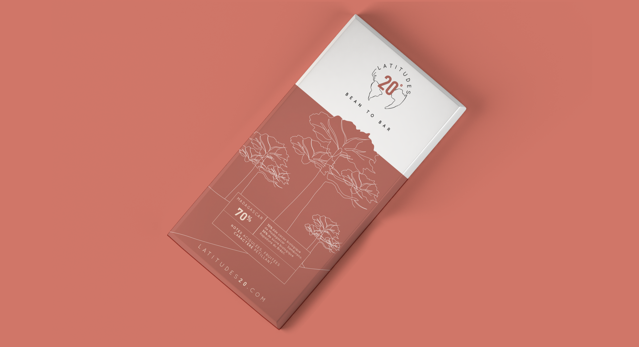
Two packaging concepts were explored — one built on country-specific gradients, the other on minimalist line illustration highlighting a signature organic element from each origin. Both share the same philosophy: let the origin speak.
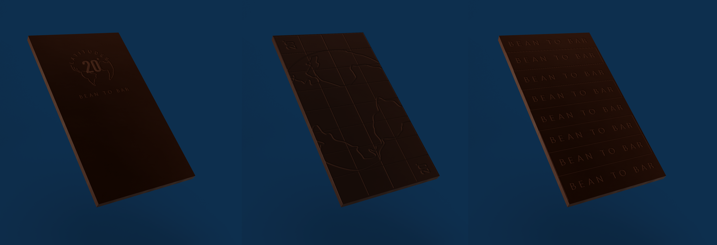
Chocolate Mold Design
The brand identity doesn't stop at the wrapper.
For Latitudes 20°, the chocolate bar itself is a design surface.
Six mold concepts were explored — embossing the bar with brand signatures: the logo, the world map, the cacao bean, the «Bean to Bar» mark. Because a truly premium product leaves nothing undesigned.
Full collection
-
![]()
Colombia
-
![]()
Guatemala
-
![]()
Madagascar
-
![]()
Guatemala 30%
-
![]()
Belize
-
![]()
Peru